Framer
How to make a Framer template easy to edit
Make a Framer template easy to edit with text and color styles, components, properties, flexible layouts and a tidy project. Plus a 20-minute edit test.
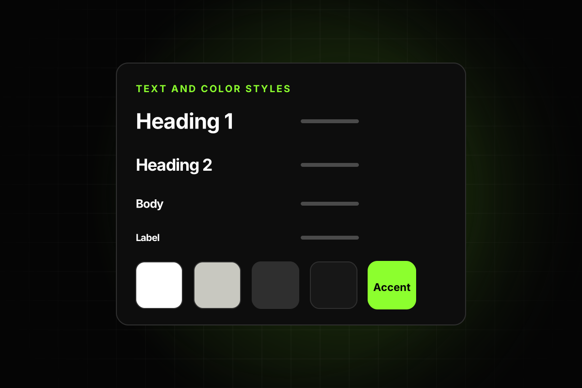
To make a Framer template easy to edit, set it up so a buyer can change the brand colors, fonts, text and images from a few central places, and the layout holds together when they do. In practice that comes down to five things: text and color styles on everything, components for anything repeated, component properties for content, stacks and auto-height layouts, and a project that’s named and organized. Get those right and a buyer can make the template theirs in an afternoon.
This guide explains each one, how to set it up, and a short test you can run before publishing to find what a buyer will struggle with.
Why it matters to make a Framer template easy to edit
Buyers don’t buy a template to keep your content. They buy a starting point. The first thing almost everyone does is change the color, swap the font and replace the copy. If that’s slow or breaks the layout, the template feels broken, even if it looks great.
Framer’s Template best practices put this front and center. Under Design: “Shared text and color styles are used throughout the template.” Under Layout: “Stacks, grids, and auto-height layouts support flexibility” and “Layouts remain organized as content changes.” Under Assets: “Assets are grouped into clearly named folders” and “File names are descriptive and easy to understand.” When it goes wrong, it leads to refund requests, which we cover in why Framer template refund requests happen.
1. Text styles for every piece of text
Text styles let a buyer change typography across the whole site from one place. Framer’s guide to setting up a site for scale recommends that you “define text styles for headings (H1, H2, etc.), paragraphs, and other elements” and “add breakpoints so styles scale automatically across devices.”
Create styles for each heading level, body sizes, labels, buttons, nav links and footer links.
Apply a style to every text layer. One unstyled button label is enough to make a buyer hunt.
Set the sizes for tablet and phone inside the style, not by overriding individual layers.
Keep the list short. Ten clear styles beat thirty near-duplicates.
Name them by role (“Heading 2”, “Body Large”), not by value (“Inter 48 Bold”).
2. Color styles for every color
A buyer changing the brand color should change one color style, not search for a hex value. The same scale guide suggests a consistent palette and “dark and light values for theming.”
Make a style for each role: background, surface, text, muted text, border, accent.
Use them for fills, text, borders, icons and shadows.
If the template has a dark and light mode, set both values on the same style.
Check gradients and SVG icons too. They often keep hard-coded colors.
3. Components for anything repeated
If something appears more than once, it should be a component. When the buyer edits the primary, every instance updates. The usual suspects:
Navigation and footer. These are the most important ones, since they’re on every page.
Buttons, including their hover states.
Cards: blog cards, project cards, team cards, pricing tiers, testimonials.
Section headers with a label, heading and paragraph.
Copies are an easy mistake to make while designing. A footer copied onto eight pages means eight edits, and the buyer will miss one.
4. Properties for the content inside components
Components are only easy to edit if the buyer can change their content without opening them. Framer’s lesson on component variables describes them as turning “selected properties inside a Component into editable controls on each instance,” useful for “text, links, colors, images, or whether an icon appears.”
Framer’s component best practices add that “properties are available for content and settings users are likely to customize” and should be clearly labeled. For a template, that means:
A text property for every heading, label and paragraph inside a card.
An image property for every photo, and a link property for every button.
A toggle for optional pieces, like an icon or a badge.
Clear names: “Title”, “Price”, “Button link”. Not “Text 1”.
Variants for real states (hover, active, mobile), not for one-off designs.
5. Layouts that survive real content
Your content is carefully sized. The buyer’s won’t be. Their company name is longer, their headline is two lines, they have five features instead of four.
Use stacks and grids instead of absolute positioning.
Set heights to auto (fit content) wherever content can grow.
Avoid fixed widths that break on smaller screens. The best practices warn against “fixed sizes that break responsiveness.”
Test with longer text. Paste a heading twice as long and see what happens.
Test with more and fewer items in grids and lists.
6. An organized project
Name layers by what they are: “Hero”, “Pricing card”, “Footer links”.
Name pages and sections so the buyer can find them. Framer suggests breaking pages into sections “for easier rearrangement.”
Group assets into folders and remove duplicates and unused images.
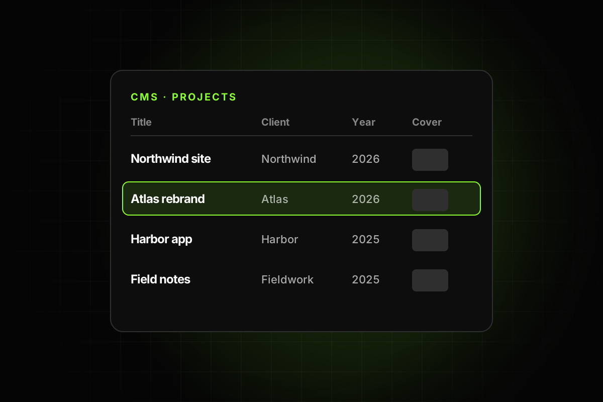
Use the CMS for anything a buyer will add more of: posts, projects, team members, FAQs. Our guide to Framer CMS best practices covers the setup.
Keep custom code minimal, and comment it. A buyer can’t safely edit code they don’t understand.
7. Leave notes for the buyer
A few lines of guidance save a lot of support email. Some options:
A hidden “Read me” page with how to change colors and fonts, where the CMS lives and how to connect the form.
Short setup notes in the listing description.
A Framer Skill. Since September 2026, skills stay with a project when someone remixes it, so you can include one that tells the Agent how your template is built. We explain how in our guide to Framer Agent Skills.
Mistakes that undo the work
A template can have styles and components and still be awkward to edit. These are the usual reasons:
Overrides on top of styles. A heading uses a text style, but its size was also changed by hand. Changing the style no longer changes that heading. Clear overrides, or create a new style if the variation is intentional.
Detached instances. A card was detached from its component to make one small change. It now looks the same but won’t update. Use a variant or a property instead.
Hidden layers left behind. Old versions of a section, hidden instead of deleted, confuse buyers in the layers panel. Delete them.
Deep nesting. A button inside a card inside a section inside a component five levels deep is hard to find. Keep component structures shallow where you can.
Images baked into text. A heading exported as an image can’t be edited or translated. Use real text.
The 20-minute edit test
Before you publish, give the template to someone who hasn’t seen it (a friend, a colleague, or yourself in a fresh remix) and ask them to do this in 20 minutes:
Change the brand color and the heading font.
Replace the logo and the hero image.
Rewrite the hero heading with a longer one.
Change a link in the footer.
Add one item to a grid and one CMS entry.
Check the result on a phone.
Watch where they get stuck. Each pause is a missing style, a copy that should be a component, or a fixed size that should be auto. Fix those, and run it again.
Check it automatically
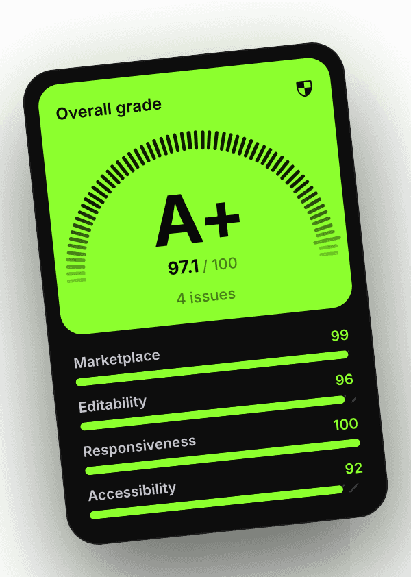
Some of this can only be judged by a person, like whether the style names make sense. A lot of it can be measured: text without a text style, colors without a color style, a nav or footer that isn’t shared across pages, repeated frames that should be components, default layer names, CMS items missing SEO fields and text that clips. The Framer template checker plugin checks all of these under its Editability score, which counts for 35% of the grade, and links each issue to the layer it affects.
A template that’s easy to edit gets fewer support emails, fewer refund requests and better word of mouth. It’s also the part of the work buyers notice most, because it’s the part they live with after launch.