Marketplace
Framer template checklist: what to check before you publish
A Framer template checklist for 2026: placeholder text, links, styles, components, responsive layouts, CMS, accessibility, SEO and your listing.
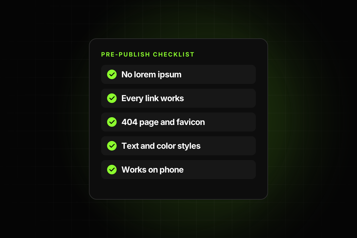
A Framer template checklist is the list of things to verify before you publish a template, so the first buyer doesn’t find the problems for you. Since June 2026, Framer no longer reviews Marketplace templates by hand, which means nobody else will catch them. The checklist below covers what to check, in the order a buyer would hit it: first impressions, editing, responsiveness, the CMS, accessibility and SEO, then the listing.
It’s based on Framer’s own Template best practices, the old review-era rules and the issues that come up most when people buy templates. Copy it into your own notes and run through it before every release.
Why you still need a Framer template checklist
The best practices page says templates “can be published without manual review” and that “you are responsible for ensuring that your template is accurate, usable, and ready for buyers.” We covered the change in Framer template requirements in 2026. The short version: the rules didn’t disappear, the checking did.
A checklist also saves time. Most of the problems below take seconds to fix once you know they’re there, and hours to deal with once a buyer has found them.
1. Things a buyer sees in the first five minutes
No placeholder text. Search every page, including inner pages and CMS items, for “lorem ipsum”, “placeholder”, “TBD” and “text here”. The best practices list “placeholder and lorem ipsum content has been removed.”
No broken links. Click every nav link, button, footer link and social icon. The best practices ask that “broken or inactive links have been removed.”
Real email and phone actions. Use
mailto:andtel:links where people expect them.A custom 404 page. It’s listed under Design in the best practices.
A favicon and social image set in site settings, not the Framer defaults.
No personal leftovers. Your own email, analytics IDs, form destinations, client names and test CMS entries.
No ads or unrelated promotion inside the template.
2. Editability
This is where most templates lose buyers. Someone who can’t change the brand color in one place will assume the whole template is badly built.
Text styles on every text layer, including buttons, labels and footer links.
Color styles for every color: backgrounds, text, borders, button fills. No hand-picked hex values.
Components for repeated elements: nav, footer, buttons, cards, testimonials, pricing tiers.
Component properties for the text, images and links a buyer will change.
Stacks and auto-height, so longer text pushes content down instead of overlapping it.
Named layers and assets, grouped into clearly named folders, with duplicates removed.
Text that doesn’t clip when a heading gets one line longer.
For the reasoning and setup behind each item, see how to make a Framer template easy to edit.
3. Responsive layouts
Check every page at desktop, tablet and phone widths, and at a width between breakpoints.
No horizontal scrolling on any page.
No fixed widths or heights that break on smaller screens.
Buttons don’t overlap or squeeze into two lines.
Body text is readable on a phone without zooming.
Menus open and close on touch devices.
Test in more than one browser. Framer’s publishing guide asks for “different browsers and screen sizes.”
4. CMS
Repeated content (posts, projects, team members, FAQs) lives in the CMS, not in duplicated frames.
Collections and fields have clear names. “Image 2” and “Field 7” don’t help anyone.
Every detail page handles an empty optional field without leaving a gap.
Empty and unused CMS items are removed.
Slugs are unique and readable.
SEO title and description fields exist and are connected on detail pages.
We go deeper in Framer CMS best practices for templates.
5. Accessibility and structure
One H1 per page, then headings in order.
Meaningful alt text on images. The best practices list “images include meaningful alt text.”
Text contrast is readable, especially light grey on white and text over images.
Form fields have labels, not only placeholder text.
Interactive elements look clickable and have hover and active states.
Motion is purposeful and doesn’t slow the page down.
6. SEO and performance
Every page has a title and description in site settings.
Images are compressed and sized for the web. The best practices warn against “large, uncompressed assets.”
Videos are hosted on a video service where it makes sense, rather than uploaded as large files.
Framer’s performance checks have been reviewed before publishing.
Custom code and embeds are only used where native features can’t do the job.
7. Licensing
Fonts, images, icons and illustrations are original or licensed for resale in a template.
You have permission for any client work shown.
External components are up to date and allowed to be redistributed.
8. The Marketplace listing
Preview images show real pages from the template.
The description says who it’s for and what’s included: pages, CMS collections, key components.
Plan requirements are stated. Per Framer’s pricing, Basic allows 30 pages and 2 CMS collections, and Pro allows 150 pages and 10 collections.
The preview URL and remix URL both work.
The refund policy is on the checkout page.
A support email is listed and someone reads it.
9. After you publish
Remix the template from the public link into a clean workspace and walk through it as a buyer would.
Re-check after Framer releases. Features change, and so do components you depend on.
Keep a changelog, so buyers can see the template is maintained.
10. Walk through it as a buyer
Most of the items above can be checked in the editor. A few only show up when you use the template the way a buyer does. Set aside 15 minutes for this walkthrough after every release:
Remix from the public link into a workspace that has none of your fonts, components or plugins. Anything that was only working because of your setup will show up here.
Read the listing first, then open the template. Does it contain every page, collection and feature the description promises?
Change the brand color and heading font. If any element keeps the old value, a style is missing.
Add a CMS item with only the required fields, and open its detail page.
Submit the contact form and check where the message goes. It should not be your inbox.
Publish to a free framer.website address and open it on a real phone, not only in the canvas preview.
Count pages and collections and compare them with the plan you list. Framer’s Basic plan stops at 30 pages and 2 collections.
Write down every place you hesitated. Those are the questions buyers will email you about, and each one is cheaper to fix now than to answer later.
How to run the checklist faster
Doing all of this by hand takes a while, and it’s easy to skip items when you’re close to launch. Some of it, like taste and copy, needs a person. A lot of it doesn’t: broken links, lorem ipsum, missing 404 or favicon, hand-picked colors, text without styles, copies instead of components, CMS SEO fields and overflowing layouts can all be detected.
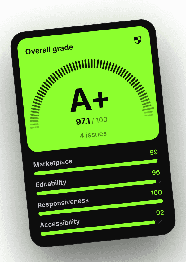
That’s what the Framer template checker plugin does. It reads the project and the published site, groups the issues into Marketplace, Editability, Responsiveness, Accessibility and SEO, and gives an A+ to F grade. Clicking an issue selects the affected layer, so you fix it in place. It doesn’t judge whether the design is good. That part of the checklist is still yours.
Whichever way you run it, run it every time. A template that passes the checklist is one a buyer can open and use the same day, which is what they paid for.